| Founded | 1965 |
| Founder | Burkard Bovensiepen |
| Headquarters | Buchloe, Germany |
| Official Site | www.alpina-automobile.de |
The Alpina brand belongs to the BMW car concern, and marks a direction specializing in the production of elite small-series sports cars based on BMW.
Meaning and History
The brand appeared in 1965 as a base for Alpina Burkard Bovensiepen KG. True, initially the company specialized in the production of spare parts and tuning of finished cars produced by BMW. Over the years of work has established itself as a manufacturer, suitable for each of his works truly individually.
The motto of the brand Alpina chose a very revealing phrase, the authorship of which is attributed to Oscar Wilde: “I am a man of simple tastes. I’m always satisfied with the best. “
Emblem
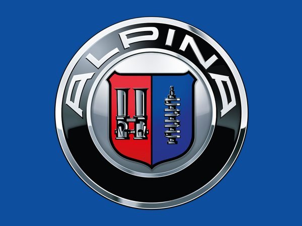
Despite the fact that Alpina is actually a division of BMW, the concern is not represented in the logo. However, the form of the Alpina logo is somewhat reminiscent of BMW, but this is the only reminder of the parent brand.
The basis of the emblem of Alpina itself is a three-lined image, which is a classic coat of arms, divided vertically into two parts. The heraldic structure of the emblem emphasizes adherence to the best traditions, and the modern form – the desire for the ideals of the future.
Symbol
The symbolism of the Alpina logo is deep enough. In addition to the already mentioned respect for traditions, it is necessary to emphasize three circles in which the image is included. Two of them “protect” the brand name, and another one – the heraldic image placed in the center. Thus, the manufacturer further emphasizes its elitism and the propensity to satisfy the wishes of true gourmets of automotive art.
Font
For its logo, the company chose a font with a uniform thickness of lines. By the way, this thickness coincides with the thickness of the lines of three circles.
Color
The logo uses three colors – classic black, white (silver), and in the heraldic structure – also blue and red.

