Car Logos | World Cars Brands Car symbols and emblems Thu, 25 Jan 2024 13:10:34 +0000 en-US hourly 1 https://wordpress.org/?v=6.2.4 https://listcarbrands.com/wp-content/uploads/2021/06/ico_car.png Car Logos | World Cars Brands 32 32 Abarth Logo https://listcarbrands.com/abarth-logo/ https://listcarbrands.com/abarth-logo/#respond Thu, 27 Sep 2018 17:58:54 +0000 http://listcarbrands.com/?p=5776 Founded 1949 Founder Carlo Abarth Headquarters Turin, Italy Parent FCA Italy Owner Fiat Chrysler Automobiles Official Site www.abarth.it The Abarth brand is one of the most famous among the brands associated with car racing. The brand’s cars have been actively participating in car racing in Italy and other European countries for more...

The post Abarth Logo appeared first on World Cars Brands.

]]>
Abarth logo

Founded 1949
Founder Carlo Abarth
Headquarters Turin, Italy
Parent FCA Italy
Owner Fiat Chrysler Automobiles
Official Site www.abarth.it

The Abarth brand is one of the most famous among the brands associated with car racing. The brand’s cars have been actively participating in car racing in Italy and other European countries for more than half a century.

History

Abarth Logo history

In 1949, the brand Abarth was registered in Turin, Italy. Its creator was Carlo Abarth, the former director of the racing team of the bankrupt automaker Cisitalia, and the investor Armando Scagliarini. They concentrated their attention specifically on specialized models, the main thing for which is to ensure a high speed and power of the car.

1949 – 1954

Abarth Logo 1949
Since the creation of the very first Abarth logo in 1949, the scorpio has always been a star of the composition. The initial badge of the Italian automaking company was composed of a detailed image of the Scorpio in blue and black, set above the bold red “Abarth & Co — Torino” uppercase lettering in a modern sans-serif typeface. This version of the logo stayed with the company for the first five years of its existence.

1954 – 1958

Abarth Logo 1954
With the redesign of 1954, the Scorpio was refined and placed on a bright yellow and red crest with the blue top part, where the yellow “Abarth & Co” inscription was set in all capitals. The Scorpio was redrawn more abstractly, with more black shades, but still, some blue gradients, which supported the blue outline of the crest and the top part with the inscription.

1955 – 1958

Abarth Logo 1955
The color palette of the Abarth logo was lightened up in 1955. Blue became turquoise and red and yellow gained brighter hues. Another change of the year was made to the inscription, with the yellow “Abarth & Co” rewritten in a bold gothic-style typeface, having its letters slightly condensed and placed close to each other, which left a lot of space on the sides of the wordmark.

1958 – 1969

Abarth Logo 1958
In 1958 the Abarth logo get changed again, with the crest becoming wider, the colors of the badge — more intense, and the scorpio in blue again. The yellow lettering was set in the bold and modern sans-serif typeface with solid and massive characters and enough space between the lines of the letters.

1969 – 2007

Abarth Logo 1969
The predecessor of today’s Abarth badge was introduced by the company in 1969 and stayed untouched for almost forty years. The scorpion was drawn in an abstract geometric style, with all elements colored in plain black. The colors of the crest were adjusted, for creating a balanced composition with the bold and sharp lines of the logo’s main hero. As for the lettering, it was shortened to just “Abarth” and was now set in white massive capitals, executed in a bold sans-serif font.

2007 – now

Logo Abarth
With the redesign of 2007, the Abarth logo gets refined and gains not only the gloss on its surface but also a line, stylized as the Italian flag, which was separating the main part of the crest from the lettering, written along with the top black banner. All shades of blue were completely removed from the logo and replaced by black. The new logotype is set in a designer sans-serif font, in silver-metallic color, supporting the color of the thin lines on the badge and its sleek outline.

Emblem

Abarth’s emblem has changed several times over the course of its history, but the fundamental change – with the addition of a scorpion – was one thing. The primary simple logo quickly ceased to suit the creator, and Carlo Abarth was literally forced to make his logo more recognizable and, most importantly, more secure from possible fakes. After all, any brand that has won the trust of consumers sooner or later faces the need to protect its trademark and good name.

Symbol

The Abarth symbol is a symbolic image of a scorpion on a red-yellow background, located on a shield. Shield, in turn, being an element of heraldic, means authority (reputation).

As for the symbolism of the scorpion, this image reflects two meanings at once. The first concerns the horoscope: Carlo Abarth was born under the sign of Scorpio. The second is the special nature of this creature, which achieves its goal at all costs and does not hide its own danger for others.

Font

For the Abarth logo, the original font was developed. Initially, the text element was the central element of the logo, but later the stylized scorpion took its current place at the intersection of two color fields, and the font became more reserved and compact.

Color

The color solution of the Abarth logo is very symbolic. The image uses red, green and white colors, the colors of the national flag of Italy. In addition, red and yellow colors have a specific meaning in the automotive world, symbolizing the race at high speed. It is this combination of colors used as the background on which the scorpion is located.


The post Abarth Logo appeared first on World Cars Brands.

]]>
https://listcarbrands.com/abarth-logo/feed/ 0
AC Propulsion logo https://listcarbrands.com/ac-propulsion-logo/ https://listcarbrands.com/ac-propulsion-logo/#respond Fri, 01 Dec 2017 10:32:29 +0000 http://listcarbrands.com/?p=5398 Founded 1992 Founder Alan Cocconi Headquarters San Dimas, California, USA Official website www.acpropulsion.com The original AC Propulsion logo is a monochrome system consisting of two curves that even those who are far from physics can see to which brand their vehicles belong. Indeed, one of the principal directions of the...

The post AC Propulsion logo appeared first on World Cars Brands.

]]>
AC cars Propulsion logo

Founded 1992
Founder Alan Cocconi
Headquarters San Dimas, California, USA
Official website www.acpropulsion.com

The original AC Propulsion logo is a monochrome system consisting of two curves that even those who are far from physics can see to which brand their vehicles belong.

Indeed, one of the principal directions of the work of the brand is the development of electric vehicles. A double helix, which in some ways can be associated with a DNA spiral, in the company logo symbolizes the movement of life, development, innovation and movement towards future.

AC Propulsion logo

The brand name – AC Propulsion became the basis for the logo in both symbolic and graphic sense. Correct and conservative, but the smoothed font supplemented the picture, giving the “open” structure of the logo a logical conclusion. Unlike most of its partners and competitors, AC Propulsion has refused to include its logo in a certain closed structure, leaving prospects for development. After all, this does not even need to violate the pre-established framework.

The post AC Propulsion logo appeared first on World Cars Brands.

]]>
https://listcarbrands.com/ac-propulsion-logo/feed/ 0
Acura logo https://listcarbrands.com/acura-logo/ https://listcarbrands.com/acura-logo/#respond Mon, 18 Jan 2016 09:01:51 +0000 http://listcarbrands.com/?p=351 Founded March 27, 1986 Founder Honda Motor Company Headquarters Minato, Tokyo, Japan Owner Honda Slogan “Precision Crafted Performance” Official Site www.acura.com Official Facebook Page: www.facebook.com/Acura Acura is the name of the Japanese automaking brand, which was established in 1986, with the idea of production of luxury cars for the international...

The post Acura logo appeared first on World Cars Brands.

]]>
Acura Logo

Founded March 27, 1986
Founder Honda Motor Company
Headquarters Minato, Tokyo, Japan
Owner Honda
Slogan “Precision Crafted Performance”
Official Site www.acura.com
Official Facebook Page: www.facebook.com/Acura

Acura is the name of the Japanese automaking brand, which was established in 1986, with the idea of production of luxury cars for the international market. The brand is owned by Honda.

Meaning and History

Acura Logo history

Honda’s division Acura specializes in luxury vehicles. Among the Japanese automaker’s major competitors are Buick, Lexus and Infiniti.

Its cars have an impressive level of luxury, upscale image, features, and performance.
Acura history is relatively brief, but this company managed to achieve a lot in a short time.

acura logo white

Honda introduced Acura in North America in 1986. Although there were only two cars available (Legend and Integra), the new company was an instance success. Autos with Acura logo appeared in the lists of world’s most desirable cars. Prices are higher than for the parent company’s vehicles, but Acura has a lot of customers because it uses the latest in technology.

1986 – 1989

Acura Logo 1986
The original version of the Acura logo, introduced in 1986, and used by the company for the first three years, was based unjust the uppercase logotype, set in flat black letters, executed in a modern stylized sans-serif typeface. The wide stable letters of the Acura inscription looked unique and futuristic, with both “A”s and “R” having their horizontal bars shortened, and contours open.

1989 – now

Logo Acura
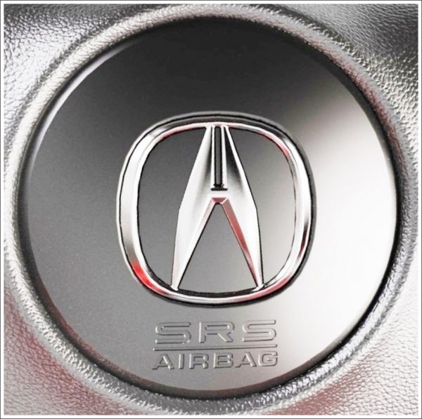
With the redesign of 1989, the Acura logotype remained untouched but got accompanied by a sleek and sharp emblem, which still can be seen on the bonnets of the brand’s cars today. The Acura emblem is a geometric element, which can be read as both a stylized “H” (for the mother company) and the “A”. Another version of the logo meaning is a caliper.

Description

Acura logo description

The logo is a stylised “A” that bears some resemblance with “H”. In this way the connection between Acura and its parent company Honda is emphasized. The lines also resemble a caliper, the tool that is a symbol of accuracy. Below the oval one can see the Acura word.

Symbol

acura car symbol images

When the Acura symbol was unveiled in 1990, there was a bit of a scandal as the first version of the logo was introduced without Soichiro Honda’s approval. It had no small horizontal bar, so it lacked resemblance with the letter “H” which stood for “Honda”. Because of this Honda ordered to destroy all badges already produced.

Font

The bold and modern uppercase logotype from the primary logo of Acura is set in a custom sans-serif typeface, which looks pretty similar to such fonts as Aspire, but with some lines modified. The Acura “R” looks different, with its horizontal bar more square than triangular.

Emblem

Acura emblem

The very name of the company emphasizes the idea of meticulousness and perfection of engineering: the word “Acura” was created on the basis of the prefix “acu,” which can be translated as “sharp” or “precise”. No wonder the company’s designers prefers to interpret the Acura emblem as an upright pair of calipers, as far as this tool is intended for pinpointing exact, detailed measurements.

Color

Color of the Acura logo

The badge that can be seen on the Acura cars is all silver, so it doesn’t leave room for speculation about the symbolic meaning of the color. Yet, when it comes to graphic design, the choice of colors becomes meaningful. Most often the basic color of the Acura logo is white, which is supposed to symbolize integrity, purity, and perfection. In many cases, the logo is black, but the background is white.

Acura MDX logo

Acura mdx logo

The mid-size three-row luxury crossover has been manufactured by Honda under the Acura brand since 2000. The wide italicized letters seem to belong to the same font as the TL logotype. The “M” and “X” have flattened vertices, while the “D” has rounded right corners.

Acura TL logo

Acura tl logo

The mid-size luxury car introduced in 1995 as a replacement for the Acura Vigor has a minimalistic script logo. The typeface is different than that of the regular Acura logo. The smooth shape of the italicized letters conveys the idea of speed, especially the “L”, which resembles a turn in the road.

Acura TLX logo
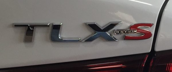
Acura TLX logoThe script logo of the mid-size sports sedan unveiled in 2014 reminds the badge of another Acura’s car, the TL. At least, the first two letters are identical. Similar to them, the “X” is wider than usual. It features sharp angles and flattened vertices.

acura badge

acura logo transparentAcura car logo

The post Acura logo appeared first on World Cars Brands.

]]>
https://listcarbrands.com/acura-logo/feed/ 0
Alfa Romeo Logo https://listcarbrands.com/alfa-romeo-logo/ https://listcarbrands.com/alfa-romeo-logo/#respond Tue, 19 Jan 2016 12:39:38 +0000 http://listcarbrands.com/?p=404 Founded 24 June 1910 Founder Nicola Romeo Ugo Stella Alexandre Darracq Headquarters Turin, Italy Parent FCA Italy Owner Fiat Chrysler Automobiles Official Site www.alfaromeo.com Official Facebook Page: www.facebook.com/Alfa.Romeo.cars Alfa Romeo is the name of the iconic Italian car marque, which was established at the end of the 19th century in Milan. Today...

The post Alfa Romeo Logo appeared first on World Cars Brands.

]]>
logo Alfa Romeo

Founded 24 June 1910
Founder Nicola Romeo
Ugo Stella
Alexandre Darracq
Headquarters Turin, Italy
Parent FCA Italy
Owner Fiat Chrysler Automobiles
Official Site www.alfaromeo.com
Official Facebook Page: www.facebook.com/Alfa.Romeo.cars

Alfa Romeo is the name of the iconic Italian car marque, which was established at the end of the 19th century in Milan. Today the brand is synonymous with the Italian automaking industry.

Meaning and History

Alfa Romeo Logo history

“ALFA” stands for “Anonima Lombarda Fabbrica Automobili” – the name of the very first plant, which was acquired by Cavalier Ugo Stella in 1910.

At that very moment, Alfa Romeo history started. Cars made by this Italian brand are famous for sporty driving characteristics and passionate styling. They started to appear in the US in 1950s.

Alfa Romeo has been a part of Fiat Chrysler Automobiles since 1986. Italian company’s racing resume is impressive. It includes 5 world championships and 4 Le Mans, over 15 European Championships and more than 10 Mille Miglias.

1870 – 1910

Alfa Romeo Logo 1870
The very first Alfa Romeo badge, designed in 1870, was completely different from all the following versions in everything, from shape to graphics. It was a rectangular banner with an arched topline, executed in a black and white color palette. The central part of the logo was taken by a solid black circle with the bold white “Alfa” written on it in a stylized sans-serif font. The circle was surrounded by vignettes and two white flowers on the sides, and underlined by the “Anonima Lombarda Fabrica Automobili Milano” inscription, decorated by thin horizontal lines.

1910 – 1915

Alfa Romeo Logo 1910
The round version of Alfa Romeo logo was created in 1910 by Romano Cattaneo, who was inspired by the emblem he had noticed in Castello Sforzesco. The board approved his sketch, and Cattaneo was entrusted with making final design.

1915 – 1925

Alfa Romeo Logo 1915
With the redesign of 1915, the color palette of the circular Alfa Romeo badge was enlightened. The heraldic elements remained in their places, and nothing has changed in terms of the composition, but the badge started looking differently due to the new hues and a more modern style of the lettering, written around the frame.

1925 – 1933

Alfa Romeo Logo 1925In 1925 the dark colors were brought back to the Alfa Romeo badge, and the logo got enclosed into one more frame, with white leaves all over the deep blue background. The badge kept its size, which means all the central elements were now smaller. So was the lettering part.

1933 – 1946

Alfa Romeo Logo 1933The frame turned all silver and voluminous in 1933. The rich gold outline of the inscription turned thin and elegant, so now the gold metallic shades were prevailing on the logo. The color palette of the main heraldic elements on the emblem also got colder, with blueish shades, and this made the logo look more distinctive.

1946 – 1947

Alfa Romeo Logo 1946The redesign of 1946 made the outer framing thinner and widened the dark blue outline with the letterings. Hence, the letters got larger too, and now the white inscription gained a new silver outline. So no golden shades remained on the Alfa Romeo logo.

1947 – 1948

Alfa Romeo Logo 1947For just one year the Italian automaker has been using a very unusual badge — the serpent and cross set in plain silver on a solid red roundel, with silver lettering written around its perimeters with no framing. It was a very minimalistic and sleek badge.

1948 – 1950

Alfa Romeo Logo 1948The traditional blue, white, red, and green Alfa Romeo badge was brought back in 1948, with intense colors, bold details, and a double golden outline of the medallion. The lettering was set in white capitals of a modern rounded sans-serif typeface, which looked clean and confident.

1950 – 1971

Alfa Romeo Logo 1950With the redesign of 1950, all the elements of the Alfa Romeo badge were refined, and the man in the serpent’s mouth was redrawn. Now it was a horizontally located figure in gradient gold, which was not crossing the vertical separation line of the badge’s central part.

1971 – 1972

Alfa Romeo Logo 1971The “Milano” part of the lettering was removed from the badge in 1971. The renewed logo looked very minimalistic and modern, with a lack of texture details and patterns, just clean contours and plain flat colors of all the parts.

1972 – 2000

Alfa Romeo Logo 1972The golden outline came back to the Alfa Romeo logo in 1972. The concept remained the same as on the previous version of the logo — minimum details and clean shapes, but with the thick golden lines, everything became brighter and more intense. The wordmark was also set in gold, written along the upper part of the frame in a strict sans-serif typeface.

2000 – 2015

Alfa Romeo Logo 2000The redesign of 2000 brought some gradients to the Alfa Romeo badge and made the golden outline of the elements a bit thinner, which created a fresher and airier composition, with lots of light-blue hues.

2015 – now

Alfa Romeo Logo
The Alfa Romeo badge was redesigned again in 2015, with all the golden shades replaced by silver, and the central circle gaining plain silver background without any separation lines. The enlarged green serpent now overlaps the horizontal bar of the red cross. The lettering also turned silver and got its sans-serif typeface replaced by a sharp and elegant serif one.

Description

This logo includes two heraldic elements associated with Milan, where the automaker’s history started: a red cross (symbol of Italian capital) and the biscione (comes from the coat of arms of the family that ruled Milan seven centuries ago). Originally this badge was made of enameled brass and had a round shape.

Logo description Alfa Romeo

In 2015 an all-new emblem was introduced. This logo, designed by Robilant Associati, differs from the original one in colors (green, red, dark blue) and typeface. Also, you can notice a silver textured background, which has replaced white and light blue field.

Symbol

Alfa Romeo symbol meaning

Company’s symbol is a quadrifoglio (green cloverleaf with four leaves) placed into a triangle. It can be spotted on Alfa Romeo racing cars since 1923. Since the 1940s, it appeared only on the upscale autos. In most models, it is placed on the side panel of an auto or on its front wings.

Emblem

Alfa Romeo emblem meaning
In 1925, following Alfa Romeo’s victory at the first World Championship, a golden laurel crown appeared on the company’s logo. It stayed there for over half a century. In 1982, the company’s designer team decided that the laurel crown should be removed. In addition to this, one more change was introduced simultaneously: the diameter of the logo was increased.

Font

The typeface of the Alfa Romeo logo, designed in 2015, features wide clean shapes of the letters with small triangular serifs coming out of the upper parts of the letters to the left. It is a custom font, but the shapes of the letters are based on Aviano Sans Black or ITC Blair Pro Bold.

 Color

Color Alfa Romeo logo

Every element of the emblem has its specific color, from the Red Cross associated with Milan and crusaders to the green snake. Due to the use of two shades of gray the logo has a 3D contrast of illumination and shadows. The machines that made emblems were destroyed during the World War II, so in 1946 a single-color version was created. It was used until 1950 when every color of the Alfa Romeo Logo returned to its place.

Alfa Romeo car logoAlfa Romeo logo

The post Alfa Romeo Logo appeared first on World Cars Brands.

]]>
https://listcarbrands.com/alfa-romeo-logo/feed/ 0
Alpina logo https://listcarbrands.com/alpina-logo/ https://listcarbrands.com/alpina-logo/#respond Mon, 27 Nov 2017 13:13:40 +0000 http://listcarbrands.com/?p=5262 Founded 1965 Founder Burkard Bovensiepen Headquarters Buchloe, Germany Official Site www.alpina-automobile.de The Alpina brand belongs to the BMW car concern, and marks a direction specializing in the production of elite small-series sports cars based on BMW. Meaning and History The brand appeared in 1965 as a base for Alpina Burkard Bovensiepen...

The post Alpina logo appeared first on World Cars Brands.

]]>
Alpina logo

Founded 1965
Founder Burkard Bovensiepen
Headquarters Buchloe, Germany
Official Site www.alpina-automobile.de

The Alpina brand belongs to the BMW car concern, and marks a direction specializing in the production of elite small-series sports cars based on BMW.

Meaning and History

bmw alpina logo

The brand appeared in 1965 as a base for Alpina Burkard Bovensiepen KG. True, initially the company specialized in the production of spare parts and tuning of finished cars produced by BMW. Over the years of work has established itself as a manufacturer, suitable for each of his works truly individually.

The motto of the brand Alpina chose a very revealing phrase, the authorship of which is attributed to Oscar Wilde: “I am a man of simple tastes. I’m always satisfied with the best. “

Emblem

Alpina emblem

Despite the fact that Alpina is actually a division of BMW, the concern is not represented in the logo. However, the form of the Alpina logo is somewhat reminiscent of BMW, but this is the only reminder of the parent brand.

The basis of the emblem of Alpina itself is a three-lined image, which is a classic coat of arms, divided vertically into two parts. The heraldic structure of the emblem emphasizes adherence to the best traditions, and the modern form – the desire for the ideals of the future.

Symbol

Symbol Alpina

The symbolism of the Alpina logo is deep enough. In addition to the already mentioned respect for traditions, it is necessary to emphasize three circles in which the image is included. Two of them “protect” the brand name, and another one – the heraldic image placed in the center. Thus, the manufacturer further emphasizes its elitism and the propensity to satisfy the wishes of true gourmets of automotive art.

Font

For its logo, the company chose a font with a uniform thickness of lines. By the way, this thickness coincides with the thickness of the lines of three circles.

Color

Color logo Alpina

The logo uses three colors – classic black, white (silver), and in the heraldic structure – also blue and red.

The post Alpina logo appeared first on World Cars Brands.

]]>
https://listcarbrands.com/alpina-logo/feed/ 0
AM General logo https://listcarbrands.com/am-general-logo/ https://listcarbrands.com/am-general-logo/#respond Fri, 01 Dec 2017 10:32:49 +0000 http://listcarbrands.com/?p=5401 Founded 1970 Headquarters South Bend, Indiana, U.S. Parent MacAndrews & Forbes Renco Group Official Site amgeneral.com The design of the classic AM General logo is quite simple in terms of composition. The basis of the logo is the name of the brand, for which a specially designed font was used...

The post AM General logo appeared first on World Cars Brands.

]]>
AM General logo

Founded 1970
Headquarters South Bend, Indiana, U.S.
Parent MacAndrews & Forbes
Renco Group
Official Site amgeneral.com

The design of the classic AM General logo is quite simple in terms of composition. The basis of the logo is the name of the brand, for which a specially designed font was used – well readable, with smoothed corners. The color solution of the logo are red, blue and white colors – they depict the national flag of the United States.

Despite the relatively modern drawing of the logo, it is designed according to the classical rules of heraldry. First of all, it concerns the direction to the right (the smoothed “spear” points to the left of the viewer, however in the heraldry the notions “right / left” are defined by the person carrying the shield with the heraldic image), that is, to the future, which is bright and successful.

AM General logo

There is an interesting gradient transition between red and blue in the “spear” (as a rule, the creators of logos don’t go with the complicated types, to which the gradient refers). However, this transition is also justified symbolically, it represents time. Time from “yesterday and today” (the left side of the heraldic object) to “tomorrow” (right side). And indeed, time and technology are united by the fact that they develop with constant acceleration.

The post AM General logo appeared first on World Cars Brands.

]]>
https://listcarbrands.com/am-general-logo/feed/ 0
Apal logo https://listcarbrands.com/apal-logo/ https://listcarbrands.com/apal-logo/#respond Mon, 27 Nov 2017 13:04:35 +0000 http://listcarbrands.com/?p=5205 Founded 1961 Founder Edmond Pery Headquarters Belgium The German car brand Apal acquired its own logo in 1961, simultaneously with the opening of the automobile production. Initially, the form of the logo was concentrated in the “mandatory” element – the circle. The name of the brand was taken as the...

The post Apal logo appeared first on World Cars Brands.

]]>
Apal logo

Founded 1961
Founder Edmond Pery
Headquarters Belgium

The German car brand Apal acquired its own logo in 1961, simultaneously with the opening of the automobile production.

Initially, the form of the logo was concentrated in the “mandatory” element – the circle. The name of the brand was taken as the basis of the logo. The title letter A, or rather, its cross, was continued and became the basis for other letters, and the whole figure was inscribed in a circle. However, later the company decided to abandon the circular form. In addition, the color elements also disappeared – the new logo became monochrome.

The brand is focused on a small niche, so the simplification of the logo was an acceptable solution – the brand was already known among potential consumers in Belgium and France. The updated logo was easier to use, it gained greater clarity. Now the brand is easily identifiable not only “at first sight”, but even, being seen by the “edge of the eye”.

Apal logo

Since 2006, new developments under the Apal brand on the market have stopped coming out. Now the company realizes its industrial potential only in the manufacture of spare parts and repair shops.

The post Apal logo appeared first on World Cars Brands.

]]>
https://listcarbrands.com/apal-logo/feed/ 0
Aston Martin Logo https://listcarbrands.com/aston-martin-logo/ https://listcarbrands.com/aston-martin-logo/#respond Mon, 12 Sep 2016 13:36:21 +0000 http://listcarbrands.com/?p=1682 Founded 1913 Founder Lionel Martin Robert Bamford Headquarters Gaydon, Warwickshire, England, United Kingdom Subsidiaries Lagonda Official Site www.astonmartin.com Official Facebook Page www.facebook.com/astonmartin Aston Martin is a luxury automaker from Great Britain, which was established in 1913 and is mostly known for its sports cars. The company has its own Formula...

The post Aston Martin Logo appeared first on World Cars Brands.

]]>
Aston Martin Logo

Founded 1913
Founder Lionel Martin
Robert Bamford
Headquarters Gaydon, Warwickshire, England, United Kingdom
Subsidiaries Lagonda
Official Site www.astonmartin.com
Official Facebook Page www.facebook.com/astonmartin

Aston Martin is a luxury automaker from Great Britain, which was established in 1913 and is mostly known for its sports cars. The company has its own Formula One team, which shows all the latest achievements of Aston Martin, constantly winning prizes.

Meaning and History

Aston Martin Logo history

The first name of Aston Martin company was Bamford & Martin, after the names of its founders, Robert Bamford and Lionel Martin. The brand got its current name in 1914 after Martin raced up Aston Hill in Buckinghamshire. The name of Robert Bamford was removed, without any objections from his side.

The Aston Martin logo was first created in 1921, and for the first seven years, the company used only its wordmark.

The brand’s visual identity has dramatically changed just once, in the very beginning, and after the iconic Aston Martin emblem was designer, the company’s logo was only slightly modified until today.

What is Aston Martin?
Aston Martin is a luxury British manufacturer of sports cars, which was established in 1913. The company’s name comes from Aston-Clinton Hill, where one of the founders, Lionel Martin, won the Singer-10 race.

1921 – 1926

Aston Martin Logo 1921

The first emblem of the make Aston Martin appeared in 1921 and represented the intertwined capitals of the company name “А” and “М.”

1927 – 1930

Aston Martin Logo 1927
The following variant of the logo was developed in 1927. Then there were the famous wings of the company borrowed, by the way, from Bentley and intended to symbolize speed.

1930 – 1932

Aston Martin Logo 1930

A year later, wings were stylized by the fashionable trends of that time.

1932 – 1939

Aston Martin Logo 1932
The first version of the iconic Aston Martin badge we all can see today was introduced by the company in 1932. It was a stylized horizontally oriented badge with two wings spread to the sides and decorated by thin glossy lines, making up the feathers. In the top central part of the logo, the rectangular banner with the black background and golden uppercase lettering on it was set.

1939 – 1950

Aston Martin Logo 1939
The redesign of 1939 changed the golden shades of the Aston Martin badge to the silver ones, which made the black banner with the inscription more eye-catching. All the other details and elements remained unchanged.

1950 – 1971

Aston Martin Logo 1950
In 1947, the name of the new owner David Brown, who brought the new epoch to Aston Martin, was added to the logo. There was the new design of cars, the new Lagonda super engines, the new victories in Le Mans and the new name on the emblem.

1971 – 1972

Aston Martin Logo 1971
The thin silver lines all over the glossy and sleek Aston Martin badge were changed to gold ones, and the logo started looking warmer, also gaining a dark-chocolate outline. In the new color palette, the insignia became even more luxurious and sophisticated.

1972 – 1984

Aston Martin Logo 1972
In several last decades, the company changed hands more than once. The name of David Brown disappeared off the logo.

1984 – 2003

Aston Martin Logo 1984
The contours of the Aston Martin logo were refined again in 1984, and the new version stayed with the company for almost twenty years. The lines became more distinctive, while the shape was also changed — the emblem was extended horizontally but got its height reduced. The inner with the wordmark was enlarged, as well as the size of the letters.

1987 – 2021

Aston Martin Logo 1987
In 1987 the company switches to a super minimalistic style with its visual identity. The iconic badge was now drawn in flat black lines over a transparent background, with the black lettering banner turning green. The inscription from the banner was repeated and placed under the winged insignia, in large size, and also in flat black.

2021 – now

Logo Aston Martin
The redesign of 2021 simplified the Aston Martin logo even more, by removing the only bright color of the badge, green. Now the name of the company was set in bold black letters on a white rectangle. Another thing that was changed — was the thickness of all the lines in the image. And the logotype under the graphical part was also rewritten in a bolder type.

Description

Aston Martin logo description

The modern emblem of the make is somewhat neutral: there are traditional wings and the name Aston Martin. The actual variant of Aston Martin logo is represented by a green rectangle on top of the white wings with the company’s name in capital letters.

Colors

Aston Martin logo colors

Aston Martin logo contains three tints: black, green and white. These colors mean special features of the make, like the style, goodwill, specialness, originality, excellence and eco-friendly type of the company.

Symbol: the latest changes

aston martin car symbol

As you can see from the pictures above, several major adjustments were introduced to the design of the logo over the years. Each era brought its own designer concepts, which were reflected in the emblem. The most recent changes were introduced to the Aston Martin symbol in 2003. They coincided with the launch of the company’s new global headquarters in Gaydon (Warwickshire, England).

Font

The iconic Aston Martin logo has been using the typeface from one family since 1987. Although on the first version of the badge it was Optima Pro Roman, and after the redesign of 2021 the typeface was changed to its Bold version. The elegant lines and slightly flared bars of the letters look fancy and sophisticated.

Emblem in Bondiana

aston martin car emblem

In 1964 the DB5 became James Bond’s car, and the Aston Martin emblem appeared in the ‘Goldfinger’ movie. The relationship lasted through eleven Bond films, or, in other words, for almost half a century. By the way, in the book version James Bond used the DB MARK III car, but the producers of the ‘Goldfinger’ decided to replace it with Aston Martin’s latest model, the DB5.

Aston Martin car logo

Aston Martin logo meaning

The post Aston Martin Logo appeared first on World Cars Brands.

]]>
https://listcarbrands.com/aston-martin-logo/feed/ 0
Audi Logo https://listcarbrands.com/audi-logo/ Mon, 26 Oct 2015 15:52:51 +0000 http://listcarbrands.com/?p=258 Founded July 16, 1909 Founder August Horch Headquarters Ingolstadt, Germany Owner Volkswagen Slogan “Vorsprung durch Technik” Subsidiaries Lamborghini Audi Sport GmbH Official Site www.audi.com Official Facebook Page www.facebook.com/audi Audi is the mane of one of the most famous German automating companies, which was established in 1909 and is a part...

The post Audi Logo appeared first on World Cars Brands.

]]>
Audi Logo

Founded July 16, 1909
Founder August Horch
Headquarters Ingolstadt, Germany
Owner Volkswagen
Slogan “Vorsprung durch Technik”
Subsidiaries Lamborghini
Audi Sport GmbH
Official Site www.audi.com
Official Facebook Page www.facebook.com/audi

Audi is the mane of one of the most famous German automating companies, which was established in 1909 and is a part of the Volkswagen Group. Known mainly as a producer of luxury vehicles, Audi keeps expanding its automobile lineup, adding new models.

Meaning and History

Audi Logo history

Logo history is enveloping four rings of Audi as other images of known car makes. The name of Audi has a complex destiny. It bears the patronymic of its establisher August Horch.

One day, during the conversation of Horch with his close associate Franz Fikentsherom, the older son of the latter one offered the name Audi, having said his landmark words: “Dad, audiatur et altera Pars (listen on the other way around) …is there any possibility to give the name “Audi” in place of “horch” to the company?” “Horch!” means “listen” in translation from German and in Latin, it will be “Audi”. This idea took instantly everyone fancy.

However, if one so wanted to call a company by his name, why could not just call it Horch? Specifically, August Horch – named in this way his first car company in the distant 1899. It was called Horch & Cie. But 10 years after that it fell out that he was evicted from his own firm and established a new one, in another town, going on to use the Horch brand. His former partners went to law against him, took the brand, and August Horch was obliged to invent a new denomination for his firm.

And now let`s relate the facts as they actually happened.

The Audi company was established in 1909 by August Horch. Its roots date back to the firm Horch non-existent now. In 1899, the talented inventor August Horch founded in Mannheim the firm “Horch And Company”, which 4 years later moved to Zwickau.

In 1909, he created a new ineffectual 6-cylinder engine, which almost led the firm to a bankruptcy, which very much resented his partners who decided to make short work to a zealous originator and to kick him away from his own firm. However, Horch established another company not far away. This firm, naturally, bore the name of Horch too. Having felt a strong competitor in a new firm, his former partners went to law against him with a request to modify the firm denomination.

The judgment was for the plaintiff and August Horch turned to the Latinized variant of the previous denomination: the word Horch meaning “listen” in German became Audi. Therefore, in 1909, the famous brand name and the not less well- known company Audi were born.

The auto Audi-A was manufactured in 1910. In 1911, the model Audi-B followed. Horch exhibited three such cars on June 1911 at the first race of Auto Alpenfart in Austrian Alps 2500 km away that came the change of famous races for the prize of the German prince Henry.

In 1912, the well-known model Audi–C appeared. At the same time, its first samples passed a serious test at the regular Alpine race and got great results.

In the 20s, the firm Audi stood on brink of a bankruptcy. It had to merge with another company.

In 1928, the company was acquired by German DKW, Yorgen Skafte Rasmussen started to possess Audi.

In 1932, the economic crisis pushed a number of German firms for creation of the concern, Auto Union. It held the former rival firms, Horch and Audi, along with DKW and Wanderer. The concern produced two models fit with the front drive and Wanderer engines. The vehicle sales were successful until the beginning of the Second World War.

After the Second World War Audi, and its partners from the Auto Union – were socialized.  They were converted to the “Coalescence of people enterprises for car production”.

In 1949, the Auto Union was modified due to the participation of the majority of the Mercedes firm’s shares.

In 1958, Daimler-Benz AG got the controlling block of the Auto Union shares, but then shares were flogged to Volkswagen. After rendering in 1965 of the controlling block of shares to Volkswagen, the denomination Audi started to be used again. Later, a new car with front wheel drive was manufactured and already by the end of the 1968, Audi came back to the market, having a good line of models and better sales. Four circles symbolizing a merger of four companies that occurred in 1932 were retained as an emblem.

The model «100» that appeared on the market in 1968, as well as its followers, including even famous Audi Quattro, were distinguished by a sport profile and drive for all 4 wheels, which was the new landmark in the automobile industry of Germany. It was the model Quattro having appeared in 1980 who gave a powerful impact to the evolution of the vehicles’ manufacturing and it earned world renown for the Audi firm, a subsidiary of Volkswagen. It was the light, fast automobile “grand of tourism” with excellent stability, a type of car for a rally. It bacame hard for the competitors to compete against this rally Quattro. The model took part uniquely well in several motor races.

In 1969, the concern Volkswagen bought Neckarsulmer Automobilwerke. As a result, the firm name changed, the firm began to be called NSU Auto Union Audi and in the summer of 1985, the firm name was again converted to Audi AG.

Since 1970, Audi’s wide export to the United States started. The first export to the USA was limited by Audi Super 90 (sedan and estate). As well as by the new Audi 100. Since 1973, Audi 80 joined them. Audi 80, unlike a European variant, existed even as an estate. Later, the Audi models received their own designations at the US market: Audi 4000 for Audi 80. Audi 5000 for Audi 100. But the repetitive cases of violations of liability of a producer for its production since the middle of 80s led to a reduction of supply of Audi to the USA.

In 1980, the all-wheel drive sport coupe attracted high attention on the Audi’s mount at the Geneva car fair. For the first time, the all-wheel drive, high-power car was offered in the form of Audi Quattro with a concept of four-wheel drive, which was still used only in trucks and SUV. The idea of such a car aroused in winter 1976/77 during test arrivals on a VW Iltis off-road vehicle being designed for the German federal armed forces. Excellent behavior of this car during movement across ice and snow led to a thought to introduce four-wheel drive VW Iltis to serial Audi 80. A variant of increased power was also developed – the five-cylinder 2.2-liter turbo engine 147 kW 200 hp of power was introduced in autumn of 1979.

In 1982, Audi 80 Quattro gave the start to the serial manufacture of permanent all-wheel drive. Step-by-step the concept of the Quattro began to be offered for other series of Audi models too.

The sport coupe (Audi Coupe) which debuted in the end of 1993 was produced on the wheelbase of Audi 80. The version with cabriolet body was for the first time introduced in Geneva in 1991. This veteran of the family Audi was taken out of production in the middle of 2000. Since the 1992 around 72 thousand of such unites were made.

In December of 1990, a new Audi 100 was represented (С 4 is its internal designation), which became also offered with a six-cylinder engine of a V-similar mold for the first time in the history of the company. Compact (128 kW. 174 hp), powerful pack with the engine displacement 2.8 liters was the shortest and the lightest in its class.

Audi A4 is a successor of Audi 80, which was in production in 1986-1994. For the first time it was introduced in October 1994. The estate A4 Avant and coupe-cabriolet A4 Cabrio saw the light in 2001. The coupe-cabriolet will get the folding rigid roof and, clearly, will be assembled at the plant of the firm Karmann.

From 1994 to 1997, several new cars were presented for the first time: Audi A8, the flagship of the Audi’s line; five-seater RS2 Avant with a 2, 2-litre 315-powerful injector turbo engine; Audi A3 created on the Golf IV platform; Audi A6 with bodywork of a sedan.

The last one was shown in Geneva at the motor show in 1997. In February 1998, the estate model of А6 Avant with a bodywork was introduced. All models of the С platform 4 discontinued in the summer of 1997 in a connection with a development of completely new A6 (4B-type).

Since the moment of a show of the conceptual Audi A2 in autumn 1997, before the beginning of batch production (the beginning of the 2000) of the model A2, slightly more than two years passed. Thus, Audi got a new family of cars of the European dimensional В class.

AUDI S4/S4 Avante/RS4, a very powerful sport modification of the Audi A4 with a 2, 7-V6-Biturbo engine. For the first time it was introduced at the motor show in Frankfurt am Main in 1997. In 1999 a modification of RS4 Avante with a 2, 7-V6-Biturbo (380 hp) engine was introduced.

In the autumn of the 1996 “sport” grades of S6/S6 Avant appeared.

The sports car Audi TT with a bodywork of a coupe was for the first time introduced in Geneva in September 1998, with a roadster bodywork – in August 1999. The prototype of the model was introduced in 1995 at the motor show in Frankfurt am Main.

AUDI S3, a sport modification of Audi A3 with the engine of 1, 8 20V with turbocharging and all-wheel drive transmission possessing high power, for the first time was introduced in March 1999.

Audi S8, a very powerful sport modification of Audi A8 with an engine of 4, 2 V8 and four-wheel drive for the first time was shown in the beginning of the 1998.

Audi Allroad, the off-roader model in the A6 Avant base was introduced for the first time on February 2000.

At present, Audi is an integrated part of the Volkswagen concern and undergoes a violent development. Such a success became possible due to the firm’s new developments.

1909 (pre-launch)

Audi Logo 1909 (prelaunch)
The original Audi logo was created in 1909 and only stayed with the company for a few months, during its preach period. It was a playful and elegant diagonally oriented inscription in light gray, with elongated and curved lines of some letters, and the tail of the “I” covering the whole inscription and crossing the left bar of the “A”.

1909

Audi Logo 1909
The first official logo was introduced in the same year, but also hast stayed for long. That was a solid black triangular pointing down with a smooth white “Audi” lettering in a custom narrowed cursive. Above the triangular the monochrome digit “1” with the spherical base was set.

1909 – 1932

Audi Logo 1909-1932
The redesign of late 1909 switched the typeface of the Audi logotype on the badge, keeping all the other elements untouched. It was a custom sans-serif font with the elongated diagonal lines of the “A” and the “D”, directed up and to the left.

1932 – 1949

Audi Logo 1932
The first depiction of the iconic four-ring logo appeared in 1932, when the four companies, including Audi, edged into one group, Auto Union. Each automaker has its right, with the original emblem in the center, The first version of the logo was set in solid blue.

1949 – 1969

Audi Logo 1949
In 1949 the four-ring logo was simplified and redrawn in the black and white palette. The emblems of the companies were removed, and now it was just four intertwined circles, set in a straight horizontal line, and crossed by a solid black rectangle with the white uppercase “Auto Union” inscription on it.

1969

Audi Logo 1969
The badge from 1969 was composed of a horizontally oriented solid black rectangle, with the bold white Audi inscription, in the same font as on the logo from 1909, followed by the uppercase “NSU”, also in white sans-serif. The badge was only used for a few months.

1969 – 1995 (badge)

Audi Logo 1969 (badge)
Later in 1969, the four-rings emblem was brought back as the main element of the Audi visual identity. The blue rings were drawn in bold lines, close to each other, and had not too much negative space inside. The overlapping areas were accented with white lines.

1969 – 1995

Audi Logo 1969-1995
With the graphical emblem, the company has been using a plate with the logotype for the same years. It was a horizontally oriented oval in solid black, with the white Audi lettering in the original typeface with diagonal bars of two letters.

1978 – 1995

Audi Logo 1978
The redesign of 1978 created another plate for the German automaker, with the red background of the ob=val, and a thin double outline in white and red, which added some air and elegance to the logo.

1955 – 2009

Audi Logo 1995
The two parts of the logo were replaced by one badge in 1995. It was a three-dimensional ring emblem in glossy silver, with the bold Audi logotype in bright red, written under it. Clean, powerful, and bright, this version of the logo was used by the company for more than a decade.

2009 – 2016

Audi Logo 2009
The redesign of 2009 made the rings thinner and darker, with more gloss added to the surface. As for the lettering, on the contrary, it became smaller and more modest, being written under the edge, on the left, in small red letters, with the iconic typeface changed to a more traditional sans-serif.

2016 – now

Logo Audi
In 2016 the German automaker decides to switch to a minimalistic design of the bag and started using a flat black emblem as the only element of its visual identity. The new concept features four solid black rings in medium-thickness lines, with no additional elements.

Description

Audi logo description

Four rings on the emblem of Audi mean a merger of four companies: DKW and Wanderer, Horch, and Audi in 1932. It was in the period of an economic recession. Such a coalescence of four automobile plants received the denomination of Auto Union. Put another way, both partners and competitors brought together.

Audi logo

After significant changes, a logo was necessary for a new company. At first, these were rings tied in a single chain and the name of each of four firms was typed in every ring. But such a logo looked overloaded and bulky, hence the decision to simplify it was taken. As a result only four rings remained. Afterwards, if at first they represented a chain, they began to look as separate rings applied on each other.

From the beginning, the Audi emblem was used only on racing cars, each company was manufacturing under its brand and adorning with its own emblems the cars made inside it. In 1964, Volkswagen bought Audi, but the former logo remained.audi logo black and white

And the last facelift of the logo: In August 2009, its design was again slightly changed. The rings look wider; but they are similar to the old ones in thickness and area. The new variant of the logo turned more elegant and sculptured.

Symbol

Audi car symbol images

The oldest car maker in Germany, Audi is proud of its long history. Yet, the brand’s CEOs also wanted its logo to emphasize the company’s approach to car design (which is changing with every new era), to reflect its strive for excellence and innovation. So, in spite of the fact, that generally Audi symbol remained the same, several minor changes were introduced over the last decade.

Emblem

Audi emblem

The most recent innovation in the Audi logo was made before the company’s 100th anniversary. In addition to the changes mentioned above, there is one new element, the “Vorsprung durch Technik” inscription. Translated from German, these words mean “Progress through Technologies”. The new Audi emblem, with its more simplistic yet modern font, is meant to reinforce the company’s bond with its customers.

Color

Audi logo description

The chrome tint of the Audi logo is glowing and brilliant, which gives the logo a modern and exquisite look.

Audi S Logo

Audi S8 logo

Audi S7 logo

Audi S6 logo

Audi S5 logo

Audi S4 logo

Audi S is a range of high performance versions of several Audi models. The first one, the S2 Coupé, was launched in 1990. The modern models from this range are based on the respective A/TT/Q (the same approach as in case of the RS range). You can recognize these cars by a distinctive “S*” badge. In addition to this element, models from the S lineup have vertical lines on their front grills.

Audi A3 logo

Audi A3 logo

A3 is a small family/compact car (hatchback) launched over 10 years ago. Initially it used the VW A platform. However, the 3rd generation switched to the VW MQB platform. Cars bearing the Audi A3 logo were the first VW Group vehicles to utilize the “PQ34” or “A4” platform resembling the modern VW Golf Mk4. At first, the A3 could be only purchased as a 3-door hatchback.

Audi A6 logo

Audi A6 logo

The A6 is a line of executive cars that can be purchased in one of the two versions: sedan or wagon. The wagon configuration is sold under the Avant brand. The A6 range is currently in its fourth generation. Cars from this line use either front-wheel drive or Torsen-based four-wheel drive. The above picture shows the Audi A6 logo as it appears on the cars’ surface.

Audi TT logo

Audi TT logo

The range of compact two-door sports cars can be recognized by the shiny Audi TT(S) logo, an example of which you can see above. The lineup was launched in 1998 by Audi’s Hungarian subsidiary. The bodyshells for the first two generations of Audi TT were produced at the company’s Ingolstadt plant, but the more recent models are manufactured only at the production facilities located in Hungary.

Audi RS logo

Audi RS logo

The RS lineup includes performance versions of certain Audi models. Their performance is even higher than that of the S range. The RS series is produced by Quattro GmbH, which is AUDI AGs private subsidiary. The Audi RS logo consists of silver letters “RS”. The “R” has a red parallelogram on the background. Although colors may vary, in most cases red and silver are used, with black and white being an additional option.

Audi Q7 logo

Audi Q7 logo

The luxury crossover SUV launched in 2005 is known as Audi’s first SUV. The full-sized model shares its platform and chassis with such well-known vehicles as the Volkswagen Touareg and the Porsche Cayenne. It is the first Audi SUV to implement the FlexRay optical fiber technology. Simple yet modern, the Audi Q7 logo includes the name of the series in silver letterings without any background.

Audi R8 logo

Audi R8 logo

The 2-seater sports car launched ten years ago utilizes the Quattro all-wheel drive system. Audi R8 is made by Quattro GmbH and uses the Lamborghini Gallardo as a platform. The Audi R8 logo features the name of the model (“R8”) with a parallelogram on the background. The lettering can be silvery, white, or black, while the parallelogram is usually red.

Audi S3 logo

Audi S3 logo

The compact sedan combines all the advantages of the company’s high-performance and high-tech know-how. It features a rather accurate (although lightly weighted) steering and an all-wheel drive. One more characteristic feature that is valued by Audi S3 fans is its sport-tuned suspension. The silver letters of the Audi S3 logo have a red and (optionally) gray background.

Audi S4 logo

Audi S4 logo

The Audi S4 logo looks almost identical to any other S* emblem: shiny lettering with a red parallelogram on the background. The designers’ decision is quite reasonable, taking into consideration that Audi S4 belongs to the S* range of high performance vehicles and shares their characteristic features. In fact, it is a high performance version of the A4 compact executive car. The first model to have the S4 badge (1991-1994) was based on Audi’s 100 saloon/sedan, but all the cars from the S4 range built after 1997 have been based on the Audi A4.

The post Audi Logo appeared first on World Cars Brands.

]]>
Austin logo https://listcarbrands.com/austin-logo/ https://listcarbrands.com/austin-logo/#respond Thu, 22 Dec 2016 16:33:08 +0000 http://listcarbrands.com/?p=2867 Successor British Motor Corporation Founded 1905 Founder Herbert Austin Headquarters Longbridge, England, United Kingdom Products Automobiles, Rover, Austin Rover, MG, Morris Defunct 1952 Meaning and history Austin was founded in 1905 in England, by Herbert Austin. It merged with Morris Motors Limited in 1952. The Austin logo has changed many times over the company’s...

The post Austin logo appeared first on World Cars Brands.

]]>
Logo Austin

Successor British Motor Corporation
Founded 1905
Founder Herbert Austin
Headquarters Longbridge, England, United Kingdom
Products Automobiles, Rover, Austin Rover, MG, Morris
Defunct 1952

Meaning and history

Austin Logo history

Austin was founded in 1905 in England, by Herbert Austin. It merged with Morris Motors Limited in 1952. The Austin logo has changed many times over the company’s history.

The latest logo version features a front view of a wheel connected with a steering wheel, and a pair of wings. The marque was in use until 1987. Over the factory’s history, the logo changed a dozen of times.

1905 – 19??

Austin Logo 1905

The bold, italicized “Austin” inscription was accompanied by a winged vehicle that had a motorcycle wheel and a steering wheel from an automobile. The outspread wings and smoke under the wheel gave the emblem a feeling of movement. One could even imagine that this vehicle is going to take off at any moment The emblem was quite detailed and had a three-dimensional appearance, which gave the logo a professional look.

19?? – 1952

Austin Logo 1952

The original emblem received rebranding by changing the style of the inscription. It was now elegant, cursive writing that gave the logo a touch of luxury and sophistication. The strokes had varying thicknesses and sharp, pointed ends. To add even more dynamics to the emblem and reflect the company’s progress, the designer placed the inscription on a diagonal.

1952 – 1959

Austin Logo 1952-1959

This emblem has a much bolder and richer appearance thanks to a black, shiny background. The name was straightened and featured thicker, more even strokes. The winged emblem was replaced by a luxurious shield with intricate decorations above it. This portion of the emblem was done in royal crimson and golden. The brand clearly positioned itself as an upper-class manufacturer.

1959 – 1962

Austin Logo 1959

This logo was created in the middle of the last century, but its minimalistic design looks stylish even today. It uses only the name, which is printed in the same style as in the second logo. The graceful, handwritten inscription placed on diagonal looks sleek in the new silver metallic color. It acquired some volume and reflected the advanced position of the brand while bringing back a classic feel.

1962 – 1987

Austin Logo

A relatively simple and at the same time colorful emblem was created in 1962. The company introduced a new font for its name. It was bold and used clean strokes with straight cuts. The font resembled MicroSquare Bold Extended or Petualang font. Underneath the name, the logo had diagonal blue and green lines that not only created a feeling of movement but also created a look that was nothing like the brand had earlier. This represented the company’s ambition to grow and position itself as a reliable and trustworthy brand.

The post Austin logo appeared first on World Cars Brands.

]]>
https://listcarbrands.com/austin-logo/feed/ 0