Founded: 1934
Founder: Hans Trunkenpolz
Headquarters: Mattighofen, Austria
Official website: www.ktm.com
KTM is a famous multinational motorcycle manufacturer, which was established in 1934 in Austria, and separated into four divisions, including the motorcycle one, in 1992. The company, formed in 1992 from the KTM Motor-Fahrzeugbau KG founded by Hans Trankenpolz, is headquartered in Matingofen, Austria.
Motorcycle History
The company was established in 1934 in Mattighofen by Hans Trunkenpolz, who was a pretty famous engineer. The first step company made as a small metalworking workshop, named Kraftfahrzeuge Trunkenpolz Mattighofen.
Where is KTM made?
KTM is a European brand, which produces its bikes on its main Austrian factory, located in Mattighofen.
The debut bike of the brand was produced by KTM only in 1953. Twenty employees of the company were able to make only three motorcycles a day.
In 1955, businessman Ernst Kronreif became a shareholder of the company, acquiring its significant share. This was the reason for the renaming to Kronreif & Trunkenpolz Mattighofen. During the first years, KTM motorcycles used components that were almost all produced by KTM itself.
This gave a strong impetus to the development of production. By the end of the fifties KTM bikes, of which there were half a dozen in the lineup, were known throughout Germany as inexpensive, but very high-quality machines. Since 1959 the company began producing scooters.
The period from the1960s to the 1970s was a bright page in the history of KTM. In 1964 a factory racing team was created, which in 1966 won three sets of gold medals in international competitions Six Days on the legendary bike KTM Comet. On a wave of popularity in two years, the company conquers the American market with the Penton Six Days model.
What does KTM stand for?
KTM is an abbreviation for Kraftfahrzeuge Trunkenpolz Mattighofen, the last names of the company’s founders and the city where it was established in.
In 1970, KTM engineers develop their engine, which was the basis of a powerful sports bike, which became a three-time winner in the World Motocross Championship. By 1974, the KTM range already included 42 models.
In 1986, KTM became the first motorcycle manufacturer to equip road bikes with front and rear disc brakes. In 1998, they offered a hingeless rear suspension, drastically reducing the unsprung mass of a motorcycle.
In 1992, KTM became insolvent and was split into three companies, of which only KTM Sportmotorcycles GmbH (since 1994 – KTM Sportmotocycles AG) continued production of motorcycles. Throughout the 90s, the company was slowly climbing out of the crisis, gradually regaining lost ground. In 2000, the company presented a prototype of the first motorcycle with a liter engine, and in 2004 came out such models as 990 RC8 Venom and 990 Super Dukes. The popularity of the latter finally brought the company back to the world top.
In 2005, KTM Sportmotocycles AG sold 80 thousand motorcycles worldwide and began a partnership with Polaris Industries, but already in 2006 KTM announced that its partnership with Polaris ended early and would instead only sell their 525 CC RFS engines to ATV.
Today, the rare motorcycle enthusiast does not know about the products of KTM. The current flagship of the company, the 1290 Super Adventure, equipped with a 1300 cc engine, is of particular interest.
Brand Logo
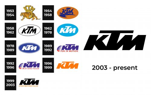
1953 – 1954
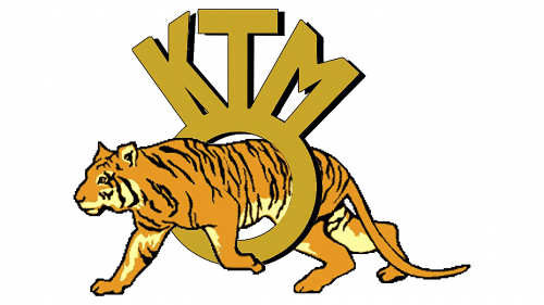
The log instantly attracts attention with the tiger illustration. It is walking through a ring, going beyond all the restrictions. The tiger is a symbol of speed, power, wildness, beauty, and courage. It also has leadership qualities. Above the ring, the logo has the brand’s name printed using a sans-serif font of the same beige color as the ring. Both have a black shadow that gives the logo a three-dimensional appearance.
1954 – 1958
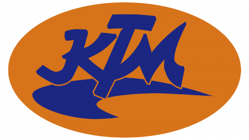
Although the tiger was gone, the orange color that is associated with this animal remained part of the brand image. It was used as an oval base holding the name. The latter is done using a cursive font that has a Japanese style. Underneath the inscription, there is a swoosh line that not only adds dynamics but also serves as a kind of shadow underneath, so the logo does not look completely flat.
1958 – 1962
The year 1958 marked the time when the brand designed a logo that would only be slightly modified in the years to come. It was based on the earlier version, but now had a more strict and bold font with straight and clean lines as well as sharp, pointed cuts and curves. The black and white color palette as well as its minimalistic, simple design gave the logo a timeless and sophisticated appearance.
1962 – 1978
The logo was modified a few years later, bringing a sky blue and white color palette. The blue is known to be a symbol of reliability and trust, which is exactly what the brand was all about. The inscription had the same feel, but there was more contrast in the stroke thickness and all the characters were joined to create an impression of a strong brand.
1978 – 1989
The company enhanced the logo by adding a double blue and white border. The blue color also got darker, which made the name literally pop against a darker background. The font was preserved the same but the oval shape along with the inscription were squished vertically to create a more elongated emblem. This version presented the company as a more serious and trustworthy brand compared to the logo used earlier.
1989 – 1992
The oval shape, which the company used for a little over thirty years is now gone. Instead, the company colored its name in blue and added a second line that said “Fun in Motion” using red, sans-serif, italicized font, and all uppercase characters. The red color was also added to the left of the wordmark in the form of a rounded shape with a toothcomb pattern on the right. This gave the logo that visual representation of motion and dynamics.
1992 – 1996
This time, the company simply replaced the red inscription with “Motorcycles”. It seemed to be more appropriate and made the company appear more solid rather than simply an entertainment company.
1996 – 1999
A bright orange color was used by the brand in the early years and it seems the company decided to bring it back. The full of energy and youthfulness color injected new life into the well-recognized brand image. The logo featured only the company name printed using a familiar font and had no other inscriptions or decorative elements.
1999 – 2003
A new color palette was introduced in 1999, bringing black as the main color with an orange accent. The first color was used for the name. The second line, which said “SportMotorcycles” was printed using the same shade of orange as in the previous logo. Despite the changes, the logo remained recognizable thanks to the use of the same style of writing for the name.
2003 – now
The KTM visual identity is simple yet sharp and powerful, just like the bikes of the famous European brand. Its main characteristics are solidness, edginess, and brightness.
The KTM logo is composed of a black inscription, and that is it. No frames, no additional lettering or ornaments.
Font and Color
The KTM logotype is executed in an extra-bold sans-serif typeface with its massive italicized letters glued to each other, and the letter “T” in the middle is taller than two others.
As for the color palette, the combination of orange and black looks modern and sharp, reflecting the audience of the brand and its main purpose. Orange stands for power and progress, while black is a color of stability and confidence, and together they make a great duo, turning the simple badge into a recognizable emblem.
Who owns KTM?
Today the Austrian motorcycle brand is owned by the Indian Bajaj and German Pieter Mobility AG.
The Legends
In 2015 KTM introduced its new iconic motorcycle, the 1290 Super Adventure. Its 1300 CC engine from the Super Duke R has been redesigned to increase torque, improving off-road riding. The bike features excellent ergonomics and the most advanced set of electronics, including traction control, ABS, stability control, and Semi-active Suspension.

