| Founded | 1958 |
| Headquarters | Changchun, Jilin, China |
| Parent | FAW Group |
| Official Site | hongqi.faw.cn |
Hongqi, a prestigious automobile brand, operates primarily within the luxury vehicle segment. The brand is renowned for its distinctive design, advanced technology, and commitment to quality. Originating from China, Hongqi has expanded its market presence significantly over the years, catering to an elite clientele who value sophistication alongside performance. At the heart of Hongqi’s operations is its dedication to innovation and the integration of cutting-edge technologies, ensuring that each model not only meets but exceeds the expectations of luxury car enthusiasts.
Meaning and History
Hongqi, which translates to “Red Flag” in English, is a luxury car brand that was founded in 1958. It is the oldest Chinese automobile manufacturer, established during Mao Zedong’s leadership to serve as a symbol of national pride and achievement. The company began by producing luxury cars for government officials, featuring iconic designs that reflected Chinese cultural motifs.
From its inception, Hongqi set a standard for high-quality automotive manufacturing in China. The company’s early models, such as the CA72, introduced in 1959, were based on a mixture of Russian and American automotive designs but adapted to include Chinese elements. This model and its successors, such as the CA770, quickly became symbols of prestige and were prominently used during state functions and parades.
Throughout the decades, Hongqi continued to evolve, marking significant milestones in the Chinese automotive industry. In the 1980s and 1990s, the company expanded its technology base through collaborations with foreign manufacturers, which helped improve the quality and competitive edge of its cars. This period also saw Hongqi venturing into commercial markets, attempting to reach private consumers.
In the 21st century, Hongqi has rejuvenated its brand image, focusing on combining traditional elements with modern automotive technology. The introduction of models like the H7 and electric vehicles such as the E-HS3 has been part of its strategy to align with global trends towards sustainability and innovation. These models have featured advanced technologies, including autonomous driving capabilities and cutting-edge infotainment systems, setting new benchmarks in the luxury segment of the market.
Today, Hongqi continues to hold a unique position in the automotive industry. It is recognized not only for its historical significance but also for its role in showcasing China’s advancements in automotive engineering. The company is now aggressively expanding internationally, aiming to compete with established luxury car manufacturers globally, and is actively involved in developing next-generation vehicles that promise to revolutionize the automotive landscape. Hongqi remains committed to its legacy of quality and luxury, continually striving to enhance its offerings and maintain its prestigious reputation.
1958 – present
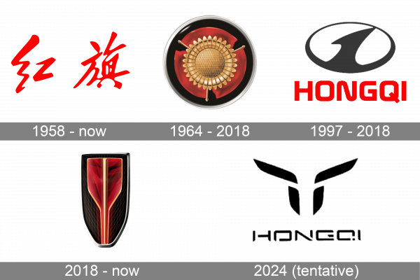
Since its creation in 1958, this logo has been the emblematic representation of the company for more than sixty years, even as it introduced various other designs. The logo features the company’s name in Chinese, which translates to “red flag.” This choice of name likely influenced the selection of a vibrant red for the text, a color deeply significant in Chinese culture, symbolizing life, success, and prosperity.
1964 – 2018
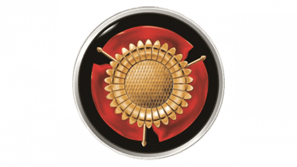
The redesigned logo eliminated any textual elements, giving it a more global appeal. The color scheme included red, gold, and black, accented by a silver trim, suggesting the heritage of a nation with a rich historical tapestry. At its heart is a metallic gold flower, with each of the three red petals adorned with three golden tips, creating a striking contrast against the black background. This design enhancement lends the logo a refined and distinguished look, making the floral motif particularly prominent.
1997 – 2018
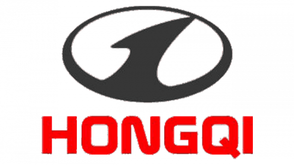
This design may inadvertently evoke the Hyundai logo, which was introduced a few years prior. The logo features a simple oval, a common choice among various brands, rendered in black and white. Inside, a smaller white oval is bisected by a black stripe, evoking the image of a road stretching towards the horizon. This element not only connects the logo to the automotive sector but also conveys a sense of ongoing movement and the exploration of future possibilities.
2018 – present
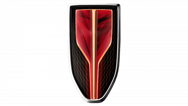
The brand has maintained the dynamic use of red and black in its logos. Echoing the 1964 design, this iteration employs gradients of red and black. The current logo is shaped like a shield with a black base and a silver outline. The red form within it tapers towards the bottom, giving it a three-dimensional look. A subtle wire mesh pattern created with thin red lines enhances the black background, making the logo particularly striking and captivating.
2024 (tentative)
The proposed logo for 2024 integrates both text and a graphic element. The text uses a geometric, sans-serif typeface with distinctive gaps in the letter strokes, reminiscent of the Perseus Arm Regular font. Above the name sits an emblem comprised of two diagonal and two vertical lines, forming an abstract image that could be interpreted as a bull’s head. However, this interpretation is not definitive. Rather, the design likely represents a minimalist and abstract evolution of the earlier shield motif.

